
Address Form
Project Overview
Our online account is available to users to upload and oversee their vehicles, owners information, and personalize it to aid in other experiences such as online shopping and building customized vehicles. Within account settings, users are able manage their address and payment information.
This project started with a small bug detection that evolved to expose the multiple functionally issues behind the experience. Being able to improve the simple capability of adding, editing, and deleting an address in an account requires deconstructing the logical settings and capabilities of the development.
Actions & Process
Reorganized address form to group similar information together
Consolidated three preference options down to one
Deconstructed the backend functionality and created a simpler interaction that reduces complexity and presents user with that information and settings they determined
Redesigned address tiles that displays user information provides the option to chance preference status with one-click directly on the tile
Results
User has full control on how they manage their personal information
Preferred is labeled and placed first indicating its priority
User can delete whatever they desire
Simpler rules for user to understand and engage with
Current Experience
Forms
The current display and interaction is unorganized and fussy. Starting with the forms, the input fields are not categorized neatly and doesn’t completely inform the user what their custom preferences mean and do for them.
What does having these preferences mean to me as a customer?
Where does this setting connect elsewhere to better my experience?

Functionality
Within account settings, a user can manage their address and credit card information.

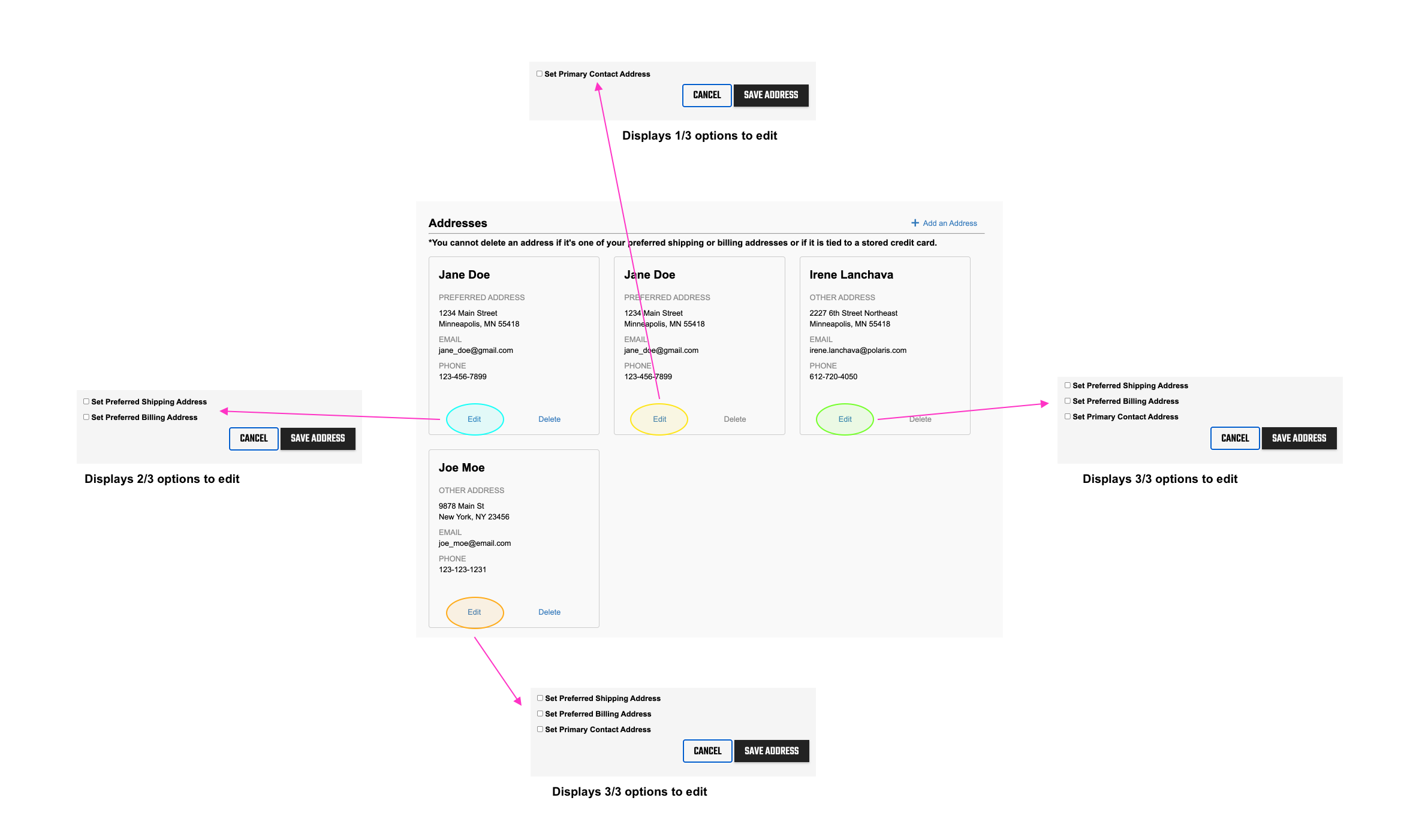
Preference editing isn’t fully available to all addresses.
Some open edits show all preference options while others do not. It made me wonder why. Is it because those addresses already have those missing preferences assigned to that address? If so, that proposes concerning experiences.
How does the user know which is selected prior to edit?
Do we require the user to remember all their interactions?
Do we require users to remember all the options available and unavailable once they’re in edit?
Address tiles do not inform which preference was selected for that address. All addresses with a preference setting are labeled as “Preferred Address”.
How will the user keep track of their settings?

After all that, once the user is free to delete they are brought to an error page forcing them away from their experience and denies their action.

It should not be a hard task to simply add, edit, or delete an address in an account.
The diagrams below demonstrate the relationships between the address and credit card interactions and managements. Currently, as explained before the does not have full control of their experience and their personal information. My proposed ideas all users full freedom in controlling that information, consolidate their preference opportunities, and clean us the backend and front end developments.

Finding the Right Terminology
Word Tests
Participants were shown this image and asked what they would call the tile with the green icon. They were given multiple word choices to select from.

First Test

The four words used in the first round are Default, Designate, Assigned, and Preferred.
Default because it is a common term used by other companies.
Designate is included because the definition of the word matches the action taken by making the selected tile what it is.
Assigned is incorporated for the same reason as designate.
Preferred is apart of the word choices because it the current term used on our platform.
Second Test

The three words used in the second round are Designate, Assigned, and Preferred. It focuses on the meaning of the words.
Default is eliminated because the definition of default is an automatic selection, which doesn’t completely represent the interaction in the experience.
Designate: Officially assign a specified status.
Assigned: Set (something) aside for a specific purpose.
Preferred: Like (one thing or person) better than another.
Third Test

The third rounds examined the words Designate and Preferred because they both were both getting a lot of association with the selected tile and the word Assigned performed poorly in both the first and second tests.
Preferred had a significant preference over Designate, the tile will continue to be referenced as the preferred address.
User Expectation & Understanding
After establishing which word to call the special address, users were tested on what the tile means and what they expect to happen when they click on “Set as Preferred”.

13/25 participants understood “Set as Preferred” turned that address into the preferred address.
Interestingly, 9 of the 13 participants who said the correct answer, described the action as turning the address into the “default” address. Why did so many participants use the word “default” in their explanations? Is “default” a more commonly term that users understand? These answers are found in more tests.
Another Word Test
This fourth test followed the same set up as the previous tests. This time the research is whether users associate the selected tile as the Default Address or the Preferred Address.
Fourth Test

The results show no strong statically significance. Because the results here and pretty even, the meaning of the words, and the performance of previous studies indicate the best decision is to use Preferred.
Another benefit of this is that “Preferred” is the current terminology used today so our users will not need to relearn terms.
Finding the Right Label
The next set of tests focus on the preferred tile’s labeling - how it is identified as the preferred address.
Style Concept
This test shows different ways to represent the preferred address. There is a simple icon, a text label, and the current representation with a grey heading. This first test will determine which design concept to follow.
The label concept is a clear favorite between participants with a 76% preference rating. Moving forward, the preferred address will be identified by a clear text label.

Testing Labels
Going with a label, I created 4 different designs.

Text on green background

Text with simple icon

Text only

Text with icon
Round One
To determine which label to place in the final design, two preference tests were conducted. One test showed the different preferred address tile designs side by side and participants were asked to select which design they prefer and support their reasoning why they made their decision. The other test had the same set up and asks but showed each preference design in a group of address.
Individual Preference Tile Results
The point of testing the individual tiles side by side is to focus on which core label design participants best responded to. This study showed the first design, the text on green background, has the strongest preference rating at 56%.

Grouped Preference Tile Results
The point of testing the tiles in a group is to mimic the experience when users enter and manage more than one address in their account. In this scenario, the first and second designs had strong results. Given the high performance of the first and second options, another round of tests are done using only those designs.

Round Two
Using the same test strategies as before, round two examines the preference between a label with text on a background and text with a simple icon.


Individual Preference Tile Results
Again the emphasis is testing the individual tiles side by side is to focus on which core label design participants best responded to. The first round results indicated the first label was the best choice but interestingly the second label in this round had the stronger rating.

35% Preference Rating
“looked like buttons, not confirmation”
“font size is slightly smaller and also lighter”

65% Preference Rating
“the check badge makes it more legitimate looking”
“check looks better and gives across the message better”
Grouped Preference Tile Results
Again, the purpose of testing the tiles in a group is to mimic the experience when users enter and manage more than one address in their account.


65% Preference Rating
“white text on the green text box can be seen more, in that the viewer can easily see their selected preferred address”
“more pleasant to the eye and I can identify the tag more easily”
35% Preference Rating
“not as noticeable”
“wasn't catching my attention”
Test Results

If one or a couple of addresses, consider the second label.
When the label options are shown in a tile alone, participants found it is better to show the second option because it did not look like a button, it is more appealing, and found it to be more legitimate.

If a group of addresses, consider the first label.
When the label options are shown in a group of tiles, participants found it better to show the first option for its clarity, boldness, and easy to understand.
Account Data
The first label works better for accounts that have multiple addresses in their account and the second label works better for accounts that have one or two addresses in their account. Looking at the average amount of addresses account owners have will determine which label to use in the final design.
Of the accounts that do have addresses on file, 79% of them only have one address listed. Therefore, the second label is the winner.


Conclusion
Of the 25% of account owners who add addresses into their account, 79% only file 1 address. The preferences tests indicate participants preferred this design is a better solution for fewer addresses linked to an account because it does not look like a button, seems legitimate, and visually appealing.

Final Design
Form
The form is organized by information type and groups similar content together. First is the address information, contact information, then preference status.

Tiles
One change is the ability of edit and remove all and any address desired with no rules attached. The biggest change is identifying which tile is the default and giving non-default tiles the ability to make it one directly on the tile with the “Set as Preferred”.

Form Interaction
The different states of the forms also get a revamp. The save button will only be activated and available once the user completed all the required fields on a New Address. On the Edit Address form once the user makes at least one change to the existing information then the save button will be activated. The reason for this is to guide users on their completion and tells them when their actions will be available to be submitted.

Address and Credit Card Functionality
The two sections no longer cross nor rely on each other. They each have their own default, settings, and capabilities that relates to only themselves. The user has full freedom to do what they desire and fully control their input, status, additions, edits, deletes. and experience.
