Order Tracking
Project Overview
The customer demand for vehicles are high while inventory levels remain low. Because of this situation, the capability of allowing customers to pre-order vehicles is newly available. With that, customers need a place where they can view and track the process of their order.
Initiatives & Goals
User Summary: As a user I’d like to be able to track my pre-sold vehicle order so up to date on it’s progress and ready to pick it up.
Create a new feature that allows for transparent messaging around the order process of a customer’s vehicle pre-order purchase.
Actions & Process
Researched competitive approaches on their order tracking treatments.
Drafted experiences and interfaces for customers to access and manage this set of information.
Tested designs to determine directions that will ensure best user outcome and design decisions.
Results
Very happy business team and positive feedback.
Test results showing success rates up to 100%.
An experience that smoothly fits into the current customer portal space and organized in a logically manner.
Starting Actions
Initial Request
I started this project by connecting with my internal clients who were looking for this feature to be built. Before thinking through UX strategies and UI solutions, it was important to communicate on the stakeholders needs, requests, goals, and fully align on all perspectives involved. The takeaways from the conversation included:
No inventory in stock and the business is allowing customers to shop for vehicles on a pre-order basis
Create a tile, a landing page, and a detail page
Determine where this information will be placed in the customer portal account experience
Journey Mapping
Three pieces of layouts need to be incorporated for this experience. A tile, that will be grouped with other tiles on the customer portal account home page, a landing page, a place to gather and list all pre-orders, and a details page, where detailed information around each order can be found.
The portal account already hosts e-commerce orders that uses a tile, a landing page, and a details page for that set of information. The easiest way to navigate to that area, a customer clicks on the “Orders” tab on the account navigation. It is logical to place the pre-order feature under the same tab and design a new structure within.

Competitive Research
The next step of action was researching how other brands approach their order tracking since this is a new feature for us and we have no data, no starting point to work from. Apple, Shopify, and Fedex had strong elements that I wanted bring into the Polaris experience.
Apple has great white space, big messaging on what the user is most interested in, and a large emphasis on the product image.
Shopify adapts to the different screen presentations nicely as the desktop view has a horizontal status bar then turns vertical to fit on the mobile screen. Also, their yet-to-be-completed steps are displayed as a grey, dotted line.
Fedex has great visual communication on the completed and current steps of their status bar by incorporating highly visible circles to mark each step and a check mark on the step the order is at.
Information Expectations
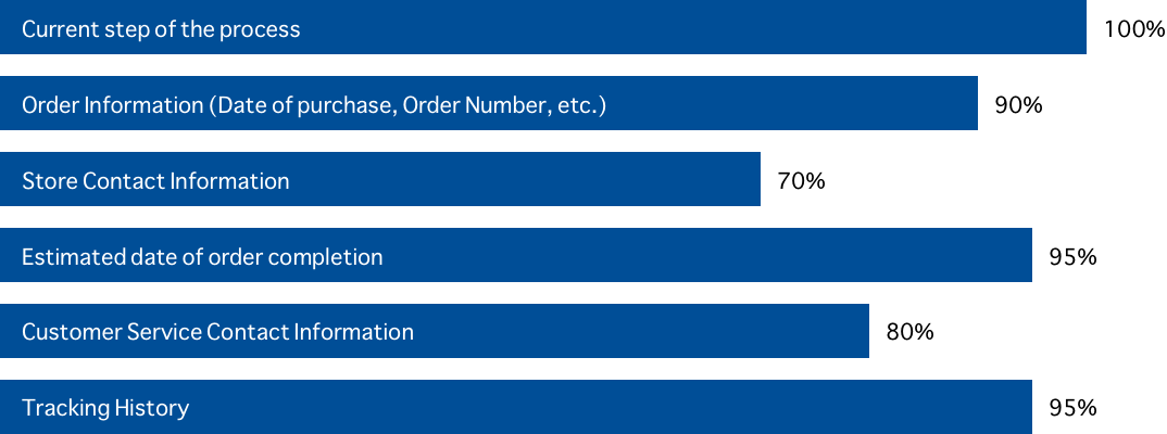
It is important to include user expectations and provide transparent communication. Using Usabilityhub and a group of 20 test particiapnts, I gathered data on those expectations around order tracking and management.
Question: Assume you pre-ordered a vehicle and want to track the status of your order. What kind of information do you expect to see?
Rough Drafts
My goal with this design is to incorporate some of the aspects from the competitive research. Simple elements featuring large emphasis on the imagery, minimal but understanding order status bar, and clear communication. The large majority of our customers visit our site on mobile so, to ensure the mobile experience and layout is great, the designs are first created for the smaller screen sizes then converted to work on the larger, desktop screen.
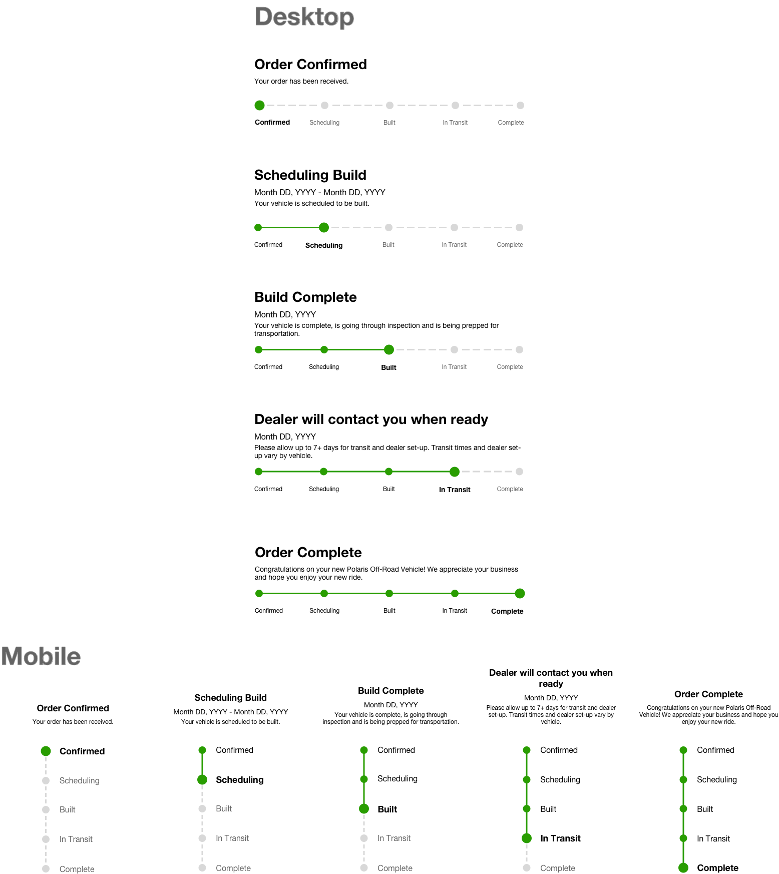
Details Page
Mobile
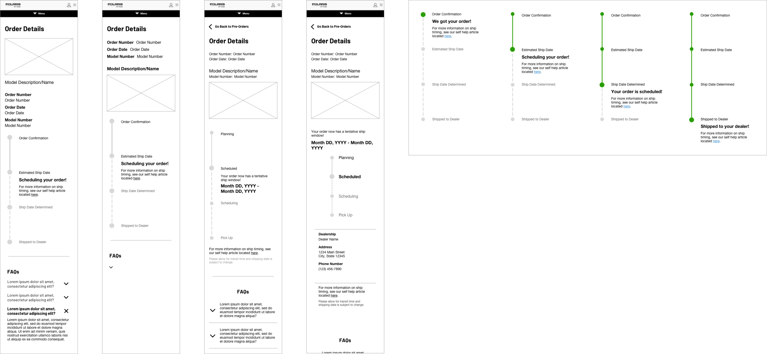
Desktop

Landing Page
Mobile

Desktop
Tile

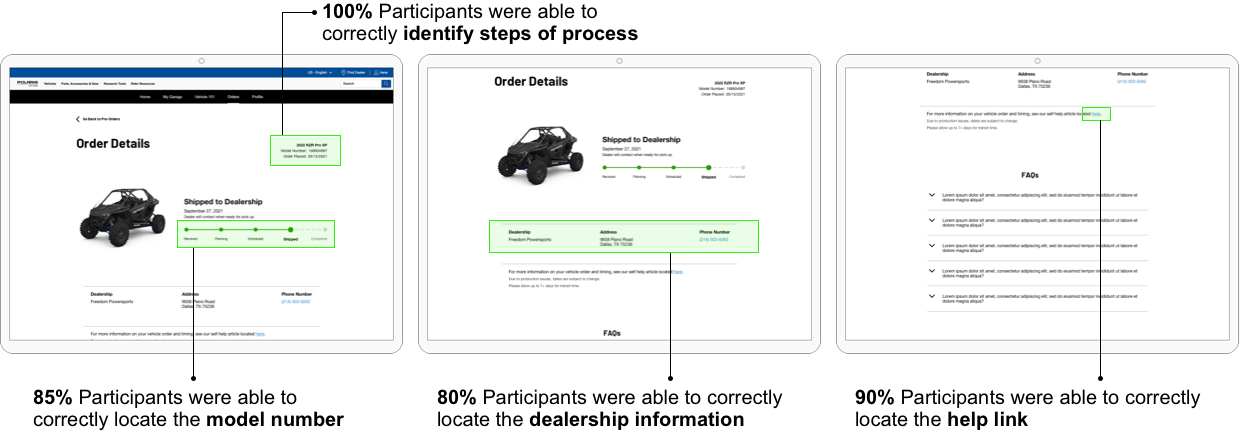
Testing Designs
To learn if the proposed designs are understandable, user-friendly, and makes sense and how to improve the experience of the design. To determine if the proposed designs are worth moving forward with, and to learn what adjustments may need to be changed, test participants were asked how they would complete tasks on the page. The goal of this testing is to determine if the layout is understandable and meets user expectations.
Orders Page
Participants were asked to locate key items on page to ensure users can easily complete tasks and find information.
Tile
The tile allows two interactions, one interactions leads to the generic landing page and the other interactions leads to the order’s detail page. Working off the brand’s guideline tile structure and styling, there are a few ways both these interactions can be incorporated.

Final Drafts
After multiple reviews with the business team, testing, and making adjustments along the way. The final designs are completed.
-
![]()
Tiles
Featuring what each step of the pre-order process looks like on the tile. The top link leads to the order’s detail page and the bottom link leads to the pre-orders landing page.
-
![]()
Ecommerce Landing Page
Under the Orders Page, the online orders tan is open and named after what type of order it is.
-
![]()
Pre-Orders Landing Page
Under the Orders Page, the Vehicle Orders is open and named after what type of order it is.
-
![]()
Order Details Page
The layout for defined information around a customers order. They have access to specific dealership information, FAQs, and clear status on their order.
-
![]()
Status Bar
Status Bar at each step for the desktop and mobile layouts.